Redesigning the core Candidate Review experience of the Banff Platform

Jul 2023 to Sep 2023 (9 weeks)
Team
-
UX researcher and designer (self)
-
Product manager
-
Two full-stack engineers
INTRODUCTION
Banff curates executive introductions
Banff is an advisory firm that helps C-level leaders (“Executive Services clients”) be more strategic with their careers.
Banff accomplishes this through curated introductions to corporations, investment firms, and executive search firms (“Banff for Business users”) through the Banff Platform.

For this release, I redesigned the Candidate Review experience, which improved the candidate profile view rate from 32% to 97% and improved the introduction request rate from 8% to 29%.
THE PROBLEM
Users aren't engaging with candidate profiles
The Banff Platform enables Banff for Business users to organize executive networking and hiring needs as “Pipelines,” and to request introductions to the candidates Banff recommends. Candidates are a mix of both non-clients and paying Executive Services clients.
Lack of engagement with profiles negatively impacts key business priorities:
-
Facilitate at least one introduction per Executive Service client per month.
-
Facilitate at least one introduction per Pipeline.
-
Gather qualitative market feedback for our Executive Service clients.
APP ANALYTICS
Analytics confirmed low engagement
To better understand the scope of the problem, I first looked at quantitative usage data.
32%
Users view only 32% of profiles sent. A “view” is counted only when a user clicks into a candidate’s profile from the Pipeline.
8%
Only 8% of candidates receive an introduction request. Because the “Request Intro” primary action is only accessible when viewing a candidate’s profile, we hypothesized that the low view rate directly contributes to the low intro request rate.
3.9
Executive Services clients receive 3.9 views per month on average. This is surprisingly low considering we send their profiles to dozens of users across multiple pipelines every month to boost their visibility in the market.
USER INTERVIEWS
Interviews: Users feel too busy to slow down for anything
To dig deeper, I interviewed five users across both our user types: three General Partners (investors) and two Search Partners. Our previous UX research yielded the following user personas, which I used as a starting point for my discussions.


I then used an affinity mapping to draw the following themes from the interviews:
-
Users spend most of their workdays in their email inboxes, even when reviewing recommended executive talent.
-
Users find clicking into each profile tedious. Again, they always feel rushed and too busy. So instead, they glance at names, roles, and companies to make snap judgments about which 2 or 3 might be most interesting and only open those. These snap judgments are subject to personal bias.
-
Once a profile is open, users ignore the actions and focus straightaway on Banff commentary. Several users expressed that they didn’t know Banff wanted them to interact with the actions. Additionally, users find some of the actions confusing. They don’t know what marking someone “Interesting” or “Not Interesting” accomplishes.
-
Users struggle to remember which profiles they have previously interacted with, especially across several Pipelines.
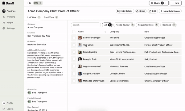
USABILITY TESTING: ORIGINAL EXPERIENCE
Usability Tests: Significant friction prevents efficient review
Testing reinforced the frustrations users expressed in interviews:
-
It is tedious to click back and forth from the table into profiles.
-
Actions are inaccessible at the table level and easily missed within profiles.
-
It is unclear which actions Banff wants users to prioritize.
HOW MIGHT WE...?
Redefining the problem...
From these pain points, I formulated the following "how might we" prompts:
-
How might we make reviewing candidates more intuitive and familiar?
-
How might we reduce friction in reviewing multiple profiles?
-
How might we encourage taking action (intros or feedback) on profiles?
-
How might we help users remember historical interactions with profiles?
LOW FIDELITY DESIGN ITERATION
Explored more intuitive structures and flows
With our pain points now defined, I began brainstorming some low-fidelity solutions with my team.

Ultimately, because users expressed a preference for their email inboxes, I explored designs that mimicked established email apps. The three most prominent features I borrowed from these experiences were:
-
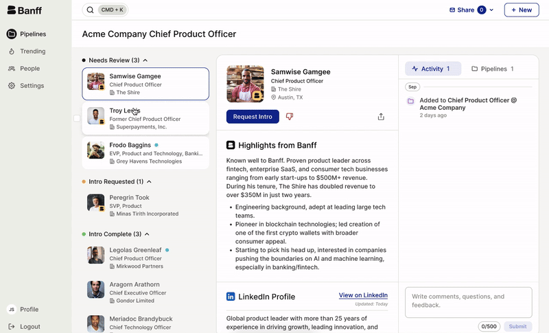
Multi-pane structure that affords quickly reviewing and actioning many items in a list.
-
Status indicators (read vs. unread).
-
Activity threads (timestamped messages and responses).

HIGH FIDELITY DESIGN ITERATION
Tested high fidelity, interactive prototypes
After testing low fidelity designs internally, I created high fidelity, interactive designs to test with our users. The second round of usability tests yielded the following feedback:
-
Users found the multi-pane structure much easier to click through to quickly review multiple profiles.
-
Users enjoyed the sense of progress they felt watching cards advance through the buckets.
-
Users liked the clarity of the Activity Log and felt more inclined to leave feedback and ask questions about profiles.

I then refined the design per user feedback.
-
I cleaned up the candidate cards by removing the "Date Added" and Activity Counter badge, which were adding clutter and confusion. I also simplified the size, weight, and colors of the fonts.
-
For the profiles, I removed the “Interesting” feedback button and status bucket to simplify possible end states to “Intro Requested” and “Not Interesting.” This made it easier for users to make quick decisions on where to place a card.
-
I also updated colors to match our overall company branding, which helped the actions pop more.

FINAL DESIGN
A more intuitive, efficient, and action-oriented experience
LAUNCH AND RESULTS
New design strongly improved engagement
After finalizing the design, I worked closely with our full-stack engineers to define release requirements. I also designed the marketing campaign for the launch, which took place in September 2023.
After two months, we returned to app analytics to measure the success of the release:
32%→97%
32% → 97% profiles viewed. Users now click through nearly all profiles in every Pipeline, instead of just the two or three most interesting cards.
8%→29%
8% → 29% intros requested. We saw a strong increase in intros requested, which directly impacted our business KPIs of facilitating quality introductions for our Executive Services and Banff for Business clients.
3.9→8.4
3.9 → 8.4 average monthly views per client. We more than doubled the average number of views our Executive Services clients receive, which increases their visibility in the market and improves their chances of being considered for coveted opportunities.
CONCLUSION
Reflections and lessons learned
My team was extremely pleased with the outcomes of this release. Recorded user sessions all showed users more easily navigating between profiles, interacting with entire lists of candidates. Here are some of my reflections from this release:
-
This release reminded me of the power of leveraging users’ mental models to make new designs more intuitive. By borrowing from email inboxes, where our investor and search partners spend most of their workdays, I was able to create a smoother and more familiar experience.
-
I’m grateful for the users who made additional time for the second round of testing (after the initial interview), as their feedback allowed us to validate and further improve the new design before devoting engineering time. This reminded me of the value of continuous testing and user feedback.
-
This was my first time working closely with an engineering team from end-to-end. I learned so much from my team, especially around how we balance the impact and development effort of features. Since our team is quite lean, we have to be pretty ruthless in our prioritization. Working with our engineers opened my eyes to the details that developers care about to deliver polished products on time.
-
Finally, I’m proud of how this design has contributed positively to real outcomes for our Executive Services clients, who are getting more looks and calls now that the new design helps to alleviate bias.
