
Timeline
June - August 2022 (12 weeks)
My Role
UI & UX Designer
Visual Designer
Web Developer
THE PROBLEM
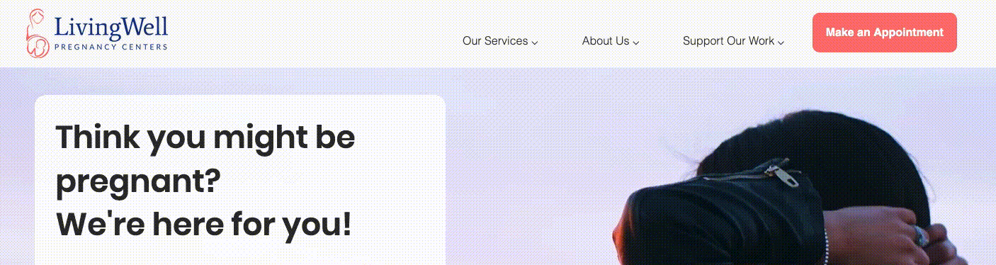
LivingWell is Losing Donors
Many young women in the Orange County, CA area need urgent access to free and low-cost pregnancy resources. Since 1985, LivingWell Pregnancy Center, a local women’s health nonprofit, has served over 160,000 women. Recently, the Center has struggled to attract new donors.
I initiated discussions with the leadership team to understand the nonprofit’s needs and priorities. After redesigning the client experience to increase service bookings, the next priority was to boost donor engagement and new donor acquisition.
Most of LivingWell's financial support currently comes from "check writers" of older generations, who enjoy fundraising events. However, the leadership wanted to figure out how to attract donors of younger generations, who prefer to give online.
WEB ANALYTICS
Missing the New Generation of Donors
To assess the extent of the problem, I performed web analytics for the current LivingWell website. I found that in a 30-day period, just 1.3% of visitors viewed the Give page, suggesting that less than 1% of visitors actually donated online.
%20vF.png)
USER INTERVIEWS
New Donors Want Credibility
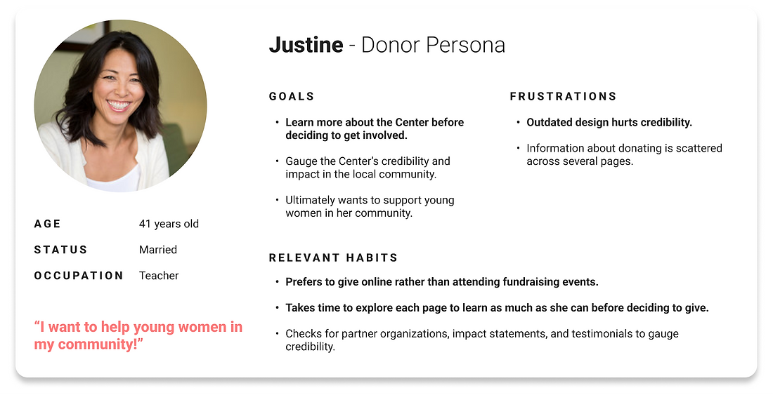
To figure out where the site was losing potential donors, I conducted user interviews and usability tests with current, former, and potential donors. I distilled the insights into "Justine," the donor persona.
The following empathy map captures how:
-
Justine wants proof of credibility and impact before deciding to donate and...
-
An outdated web experience hurts credibility enough to deter her from giving.
She feels curious about the Center and eager about the mission, but she also feels skeptical and annoyed by the confusing navigation and dated visuals.
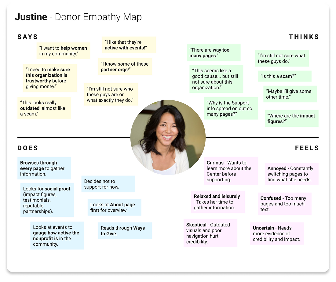
Additional Insights
-
Donors tend to browse through all the pages of the site to gather information (in contrast to clients, who just want help fast and who therefore have more targeted browsing patterns).
-
Donors use the Events page to gauge activity and impact in the community.
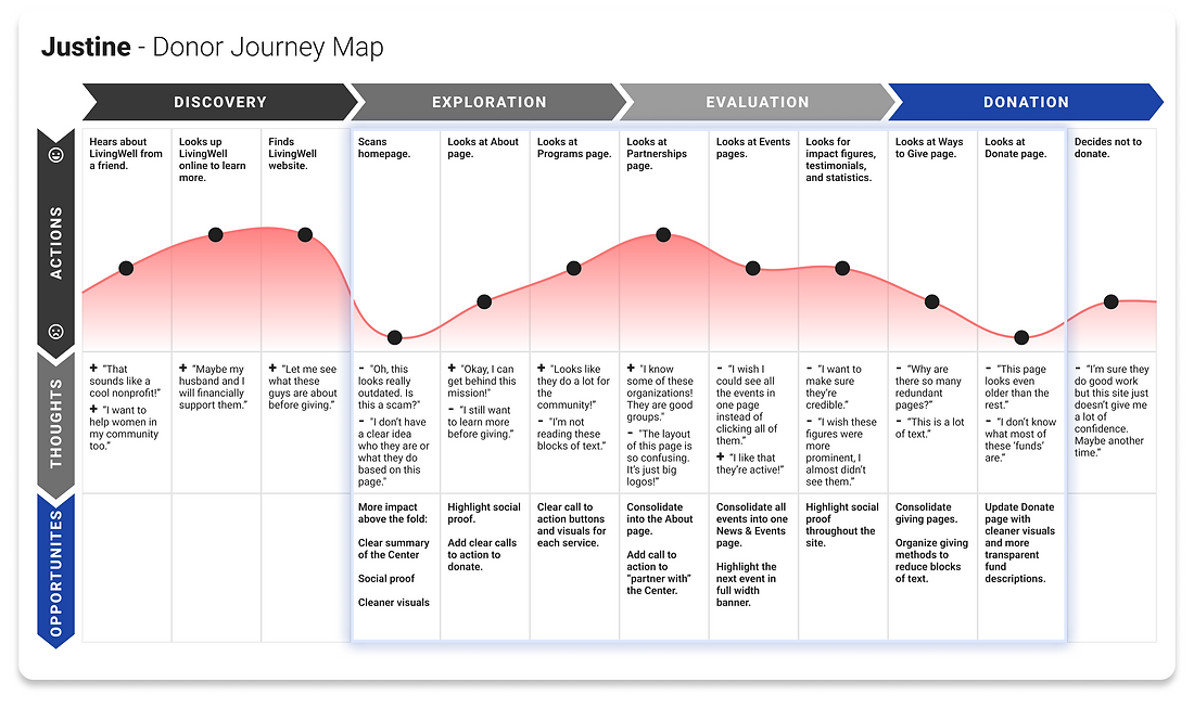
The journey map below captures Justine's experience with LivingWell. The dips in the Exploration, Evaluation, and Donate phases highlight how the biggest barriers to engagement and conversion are:
-
Confusing navigation due to poor information architecture,
-
A lack of direction and social proof on the homepage, and...
-
The outdated visual design.
THE PROBLEM RESTATED + PROPOSED SOLUTIONS
LivingWell is Failing to Convert New Donors Because of...
1. Confusing navigation due to poor information architecture. → Simplified information architecture.
2. A lack of direction across pages, especially Home, About Us, and Donate. → More impact above the fold, with social proof (testimonials and impact figures) and clearer call to action buttons.
3. Outdated visual design that hurts credibility. → Cleaner visual design adhering to WCAG standards and more prominent social proof.
INFORMATION ARCHITECTURE
Strategic Simplification
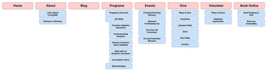
To tackle the first problem of confusing navigation, I took inventory of the content and to reorganize it to align with user and business priorities.
STRUCTURE
I grouped top menu items by audience. For example, since clients were in a much more urgent state of mind when using the site, I put “Our Services” as the first menu item.
Then, since donors tended to take their time going through each page, I put “Support Our Work” last. This also capitalized on the serial position effect, which states that users tend to best remember the first and last items in a series.
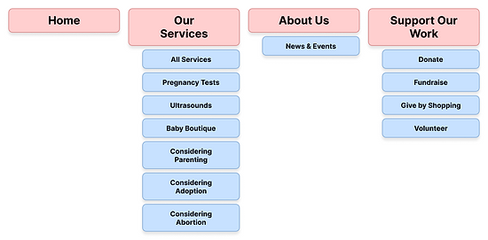
CONTENT
I also consolidated the support information to simplify the donor experience. Ultimately, I was able to condense the site from 35 pages to 15 (a 57.1% reduction), and the top menu from 8 items to 4 (a 50% reduction).
WIREFRAMING
Intentionally Guided User Flows
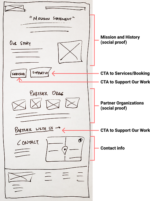
Second, to address the lack of direction on key pages, I sketched wireframes to draft new user flows focused on conversion.
Clear Paths to Donate
Since donors most frequently viewed the Home and About Us pages first, I redesigned them to have clear paths to the Support Our Work page. This way, potential donors could take action at any point in their information-gathering phase.

Content-Rich Pages for Simplified Evaluation
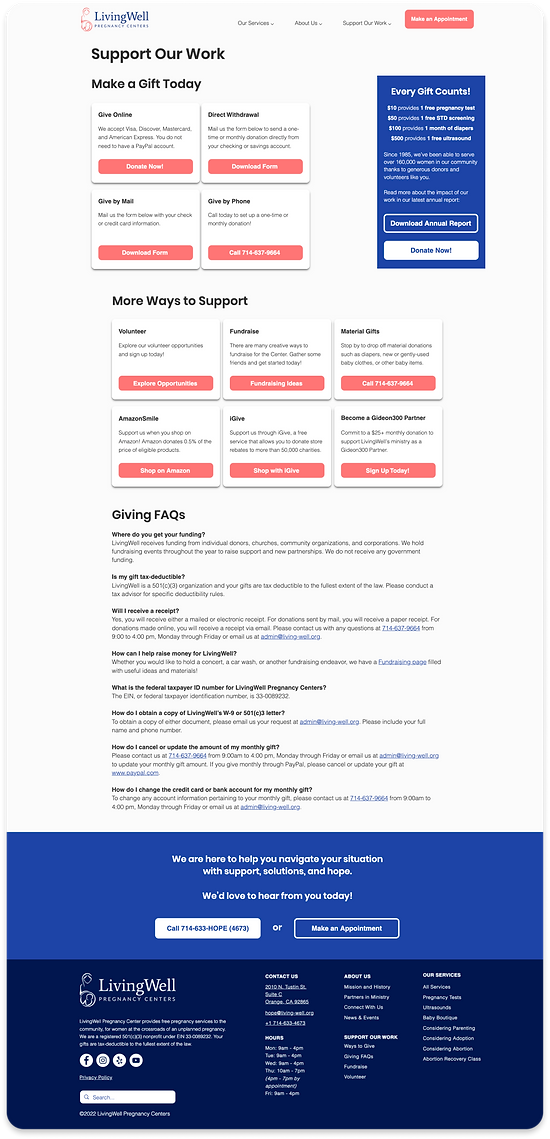
Many donors complained that information was too scattered to efficiently evaluate the nonprofit. I redesigned key pages to provide more social proof, clearer calls to action, and more readable text.
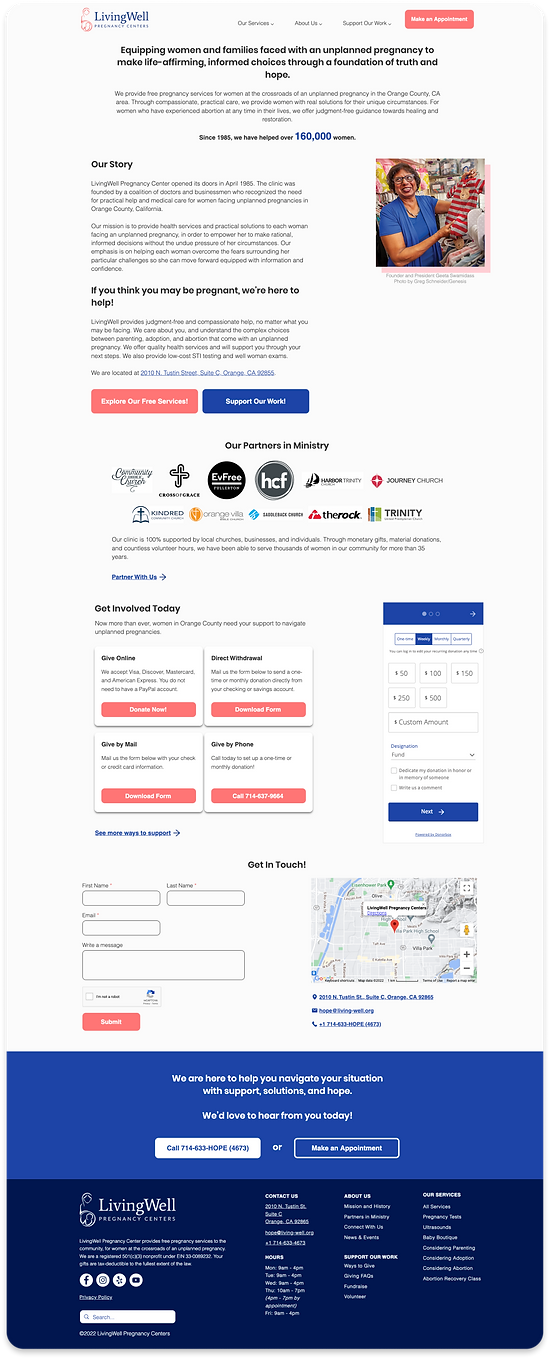
About Us (BEFORE)
About Us (AFTER)
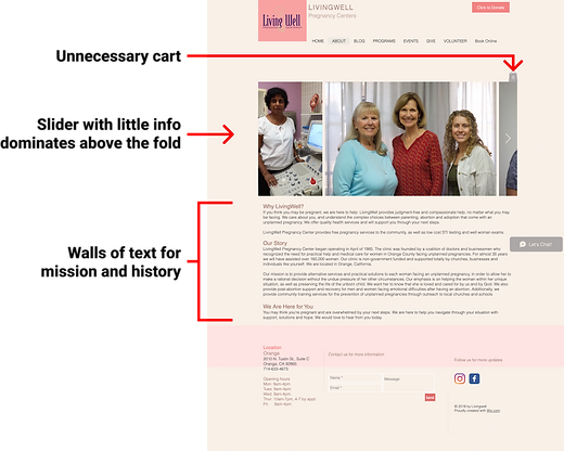
Give (BEFORE)
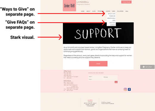
Give (AFTER)

STYLE GUIDE
Breathing New Life into the Brand
After validating the basic flows with users, I turned to the final problem of outdated visual design. You can read more about this phase in my case on redesigning LivingWell's client experience.
HIGH FIDELITY MOCKUPS
Stronger Credibility for Stronger Donor Engagement
I combined all the new elements into high fidelity mockups for final testing before development.
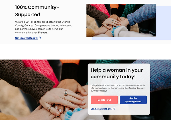
Donor key frames (About Us, Support Our Work)
USER TESTING
User tests yielded 2 major improvements
Elevated donor experience on the homepage
-
In my early iterations, the homepage focused primarily on getting clients to book the services they need as quickly as possible, but unduly de-emphasized the donor experience.
-
Now, the homepage features full width banners for both user groups, while still prioritizing clients. Donors expressed that they felt more engaged by the banner with its clearer calls to action.
Restructured navigation for consistent hover behavior
-
The original menu had two menu items with submenus (with the top menu items being unclickable), and two without. Users found the inconsistency of clicking/hovering behavior confusing.

-
The new restructured menu makes all three top menu items have submenus on hover, simplifying navigation.
NEXT STEPS
Development and Launch!
With the design complete and approved by the leadership team, I built the website using Wix. After marketing strategy development and other final checkpoints, the new donor website is expected to go live by the end of 2022.
CONCLUSION & REFLECTIONS
What I learned...
-
Balance the needs of different user groups. Early on, many of my designs focused primarily on the client user group, who used the website with more rushed, anxious mindsets. But in doing so, I inadvertently neglected to address the business objective of increasing donor acquisition and engagement. Thankfully, through further discussions with the leadership team, I was able to take a step back and build out stronger experiences for both groups.
-
Visuals go last. My users expressed far stronger frustration with the navigation of the original website than with the visuals. They were amazed by how much more seamless the simplified information architecture made the browsing experience. The new visuals certainly helped with the Center's credibility, but removing the mental load of looking through dozens of redundant pages will probably do more to reduce bounce rates and increase conversions.
Overall, I'm very proud of this redesign and grateful to the LivingWell team for their amazing work!
