Timeline
June - August 2022
My Role
UI & UX Designer
Visual Designer
Web Developer
THE PROBLEM
LivingWell is Losing Clients
Many young women in the Orange County, CA area need urgent access to free and low-cost pregnancy resources. Since 1985, LivingWell Pregnancy Center, a local women’s health nonprofit, has served over 160,000 women. Recently, the Center has struggled to attract new clients.
I initiated discussions with the leadership team to understand the nonprofit’s needs and priorities. The first priority was to increase service appointments for clients.
WEB ANALYTICS + HYPOTHESIS
Simplifying Booking Process Would Increase Conversions
To assess the extent of the problem, I performed web analytics for the current LivingWell website. The traffic breakdown below shows how because clients must navigate up to 6 pages to book a service, less than 1% make it to confirmation.
I hypothesized that reducing the steps to book an appointment would increase conversions.
.png)
I also found that in the last year, around 72% of visitors were on mobile devices, with nearly 77% of mobile visitors on Safari on an iPhone. This highlighted the importance of the mobile experience of the website.
USER INTERVIEWS
Anxious Clients Need Immediate Help
To better understand the low conversion and high bounce rates, I conducted user interviews and usability tests with current, former, and potential clients. I distilled the insights into "Monica," the client persona.

The following empathy map captures how:
-
Monica just wants free services fast, and...
-
If she can't immediately find what she needs in a site she will leave and look elsewhere.
She feels anxious about her situation and frustrated by how hard it is to book an appointment.

Additional Insights
-
Clients primarily used their phones to visit the website because they did not own a desktop and/or because they felt that looking for solutions from cellphone was more immediate.
-
Clients wanted to be able to quickly call the Center with questions or to make an appointment.
Clients also complained that in the current "Booking" user flow below...
-
The only call to action above the fold is to donate, which does not appeal to clients, and...
-
There are too many steps to book an appointment.

The journey map below captures Monica's experience with LivingWell. The dip in the Exploration and Booking phases highlights how:
-
Excessive steps to book a service prevents conversions,
-
A lack of direction on the homepage hinders further exploration, and...
-
The outdated visual design and lack of social proof hurts credibility.

THE PROBLEM RESTATED + PROPOSED SOLUTIONS
LivingWell is Failing to Convert Clients Because...
1. Excessive steps to book a service prevents conversions. → Provide one-tap booking from the homepage.
2. A lack of direction on the homepage hinders further exploration. → More impact above the fold, with a succinct summary of the Center, social proof (testimonials and impact figures), relatable visuals, and clear call to action buttons.
3. The outdated visual design and lack of social proof hurts credibility. → Cleaner visual design adhering to WCAG standards and more prominent social proof.
WIREFRAMING
Streamlined User Flows
To address the first two problems of complicated booking flows and an ineffective homepage, I iterated wireframes with simplified layouts and streamlined flows.
Based on the research, I hypothesized that giving clients one-tap booking on the homepage would significantly boost conversions.
.png)
Reduced steps to book a service by 80%.
-
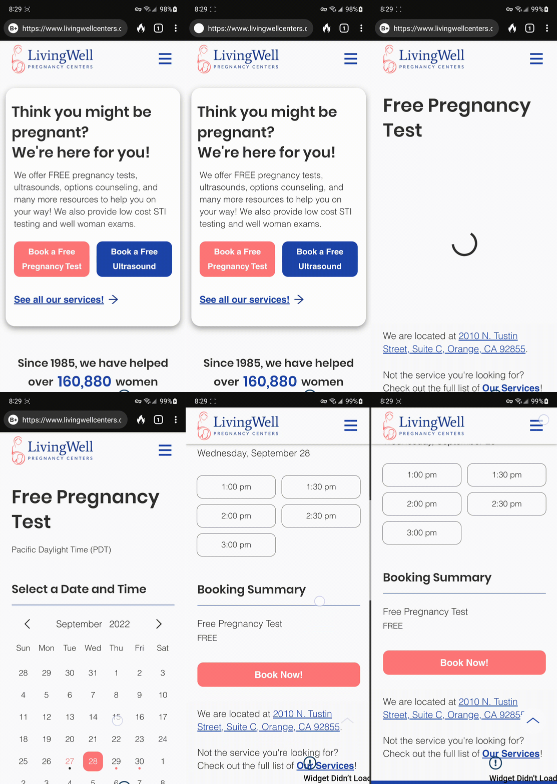
Since 72% of visitors are on mobile, I designed a new mobile layout with one-tap booking.
-
In the original "Our Services" page, clients were confused when they couldn't click on services to proceed. The new page provides a clear call to action for each service.

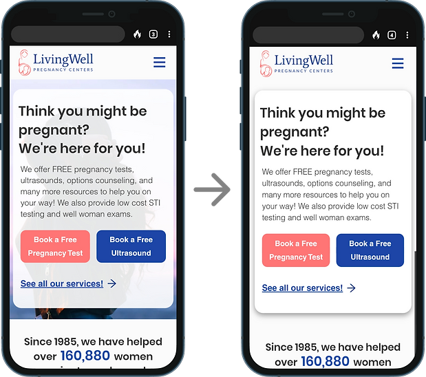
More impact "above the fold."
BEFORE:

AFTER:
.png)
STYLE GUIDE
Breathing New Life into the Brand
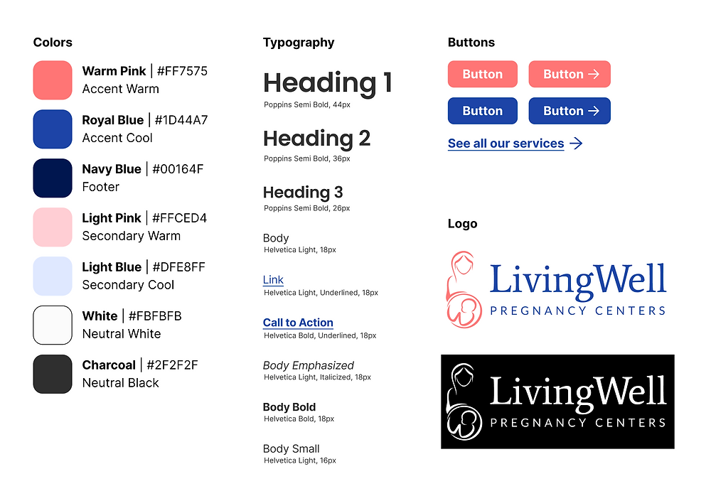
After validating the basic flows with users, I turned to the third problem of outdated visual design. Clients complained that the logo was difficult to interpret and the current design felt outdated, which hurt the Center's credibility.
I began with designing a new logo that carried the spirit of the original while improving visibility.


After receiving approval from the leadership team, I built out the rest of the guide to match the logo.

HIGH FIDELITY MOCKUPS
A Revamped Client Booking Experience
I combined all the new elements into high fidelity mockups for final testing before development.
Client key frames (Home, Service Booking, All Services)


USER TESTING
User tests yielded 3 major insights
Clients loved the new mobile booking process.
-
Clients emotionally resonated with the header question above the fold.
-
Clients unanimously approved of the new mobile experience, with booking just one tap away.


Some clients first look for a phone number.
-
Some clients jumped straight to the bottom of the homepage looking for a number to call, believing this would be faster than booking online.
-
I added a big call button to the footer for easy access across all pages.


Clients felt the hero image obscured the homepage items on mobile.

NEXT STEPS
Development and Launch!
With the design complete and approved by the leadership team, I built the website using Wix. The new website went live October 2022.
From here, I am continuing to monitor analytics, especially conversions, to surface further areas of improvement.
CONCLUSION & REFLECTIONS
What I learned...
This was my first UX project with a real business client. A few of my takeaways:
-
Align business and user priorities from the start. When I first saw the original website, my instinct was to come up with a million ways to improve the site aesthetically. But thankfully, I was able to take a step back and instead begin with discussions with the directors and users. These conversations enabled me to focus on improving the overall user experience with specific goals in mind, and not just beautify the user interface with no real business impact.
-
User research is not a hammer. There were some points in the process where the leadership team and I disagreed on certain design decisions. Although I was tempted to use my user research as a "hammer" to squash opposing views, I realized that it was more important to instead build alignment with the leadership through winsome, collaborative communication. This enabled us to better understand the various perspectives and priorities at stake, to ultimately better serve the clients and donors.
Overall, I'm very proud of this redesign and grateful to the LivingWell team for their amazing work!

