Creating a new Executive Discovery experience in the Banff Platform
May 2024 to July 2024 (6 weeks)
Team
-
UX researcher and designer (self)
-
Product manager
-
Two full-stack engineers
-
One back-end engineer

INTRODUCTION
Banff curates executive introductions
Banff is an advisory firm that helps C-level leaders (“Executive Services clients”) be more strategic with their careers.
Banff accomplishes this through curated introductions to corporations, investment firms, and executive search firms (“Banff for Business users”) through the Banff Platform.

For this release, I redesigned the Executive Discovery experience, which increased the average monthly views per Executive Services client from 8.4 to 12.7 and tripled the introduction request rate from the People page.
THE PROBLEM
Users have trouble finding profiles Banff previously shared.
The People page enables Banff for Business users to revisit and rediscover executive profiles Banff previously recommended to their team. Users may also request introductions from this page.
Users not requesting intros or leaving feedback negatively impacts key business priorities:
-
Facilitate at least one introduction per Executive Service client per month.
-
Facilitate at least one introduction per Pipeline.
-
Gather qualitative market feedback for our Executive Service clients.
APP ANALYTICS
Analytics suggested inaccurate search results.
To better understand the scope of the problem, I first looked at quantitative usage data.
Our Elasticsearch records showed that users tend to use the search bar on the People page to look for candidates with specific job titles, current/former experience at specific companies, or experience in specific industries. However…
26%
26% of searches return empty. The search function on this page was limited to exact matches on candidate names and current roles and companies, which meant many queries returned empty, and most returned incomplete without explanation.
8.4
Executive Services clients receive 8.4 views per month on average. However, even though the People page is the 2nd most viewed page in the app, less than 20% of searches led to users actually clicking and viewing an executive profile.
<1
Average <1 intro request per month. Users did not request intros from this page, possibly because they failed to find the profiles they were looking for.
USER INTERVIEWS
Interviews: Users want a smarter search experience.
To dig deeper, I interviewed five users across both our user types: three General Partners (investors) and two Search Partners. Our previous UX research yielded the following user personas, which I used as a starting point for my discussions.
I then used an affinity mapping to draw the following themes from the interviews:
-
Users want to be able to easily revisit interesting profiles as needed. They often look to meet executives for expert perspectives and/or future hiring, meaning they sometimes prefer to not take immediate action.
-
Users tend to look for specific experiences, skills, or markers of past success. These include industry expertise, revenue scale and growth, company stage experience, and what types of roles the executive is currently interested in.
-
Users want a more intelligent system for searching through profiles. Current tools are unwieldy, with incomplete data.
-
Users find the current People page inefficient. They already have multiple channels for discovering executives, and although the Banff ecosystem is more cost-efficient than search firms and more effective than cold outreach, revisiting profiles is a clunky experience.

USABILITY TESTING: ORIGINAL EXPERIENCE
Usability Tests: Incomplete results, unclear actions.
Testing reinforced the frustrations users expressed in interviews:
-
It is difficult to evaluate profiles at a glance.
-
Search results are often empty or incomplete, with seemingly random exclusions.
-
If users can’t find profiles, it is unclear what they can do next.

HOW MIGHT WE...?
Redefining the problem...
From these pain points, I formulated the following "how might we" prompts:
-
How might we improve the accuracy of search results?
-
How might we surface the categories of data users expect?
-
How might we encourage taking action, whether or not matching profiles have been found?
DESIGN ITERATION
Part 1: Improve search result accuracy.
First, I worked with our back-end engineers to redefine which aspects of a profile should be searchable. We reviewed my user interviews as well as a sample of 300+ search results to determine how best to prioritize matches.
I also updated the design of the profile cards to surface excerpts where the match was found, to help the user quickly understand why a profile is included in the results.

Part 2: Categorize types of data.
Since there were specific categories of information that users tended to look for, I decided to surface that data as tags on the profiles themselves, so users could evaluate matches at a glance.
v1. Tags listed above tab menu for additional info.

v2. Tags organized by type for easier scanning.

Based on these, I decided that filters could be a way for users to efficiently search by categories of information.
Version 1 had a simple modal.
Although the modal did a good job of surfacing all the available filters, it lacked visibility into the expected number of results.
It also did not manage space efficiently (especially when many filters were active at once).
Version 2 had recommended filters based on available profiles.
Although I preferred the full-width filter bar up top, I felt this design did not clearly communicate to users where these suggestions were coming from.
I also thought it might make it more difficult for users to find the values they’re looking for.

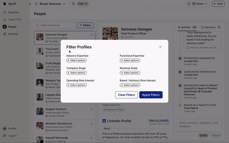
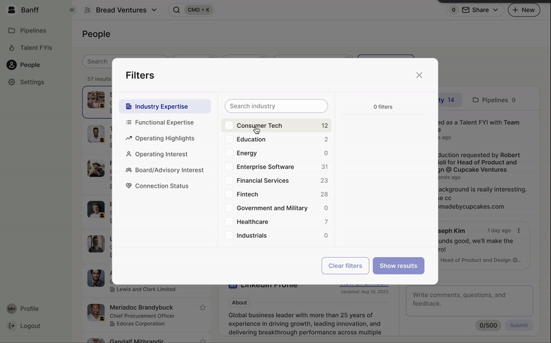
The final version enables users to build their query in stages.
This modal offers more visibility into the expected number of results with each modification.
I also decided to keep the Industry, Function, and Operating Highlights filters always visible, since they are the three that users would use most often.
Part 3: Clearer next actions.
In the original experience, if a user failed to find relevant profiles, there was no clear next step they could take. I added the ability to open a new Pipeline to request new recommendations based on selected filters.

LAUNCH AND RESULTS
New design improved discoverability of profiles.
After finalizing the design, I worked closely with our full-stack engineers to define release requirements. I also designed the marketing campaign for the launch, which took place in July 2024.
After two months, we returned to app analytics to measure the success of the release:
26%→8%
26% → 8% search results empty. Redefining searchable fields and surfacing the matched text enabled users to more accurately find relevant profiles.
<1→3
<1 → 3 intros requested per month. We saw an increase in intros requested from the People page, which directly impacted our business KPIs of facilitating quality introductions for our Executive Services and Banff for Business clients.
8.4→12.7
8.4 → 12.7 average monthly views per client. By making candidates more easily discoverable, we increased the average number of views our Executive Services clients receive, which increases their visibility in the market and improves their chances of being considered for coveted opportunities.
CONCLUSION
Reflections and lessons learned
My team was extremely pleased with the outcomes of this release. Recorded sessions showed users actively engaging with the filters and clicking through search results, rather than simply querying the search bar and giving up.
Although the filter modal took several iterations to crack, I’m glad I took the time to test different versions to land on one our whole team was happy with. It was a challenge to balance intuitive interaction, efficient use of space, and clear guidance for users, but the final version benefitted from ample research and internal feedback.
Lastly, I’m proud of how this design has contributed positively to real outcomes for our Executive Services clients, who are getting more looks and calls now that the new design makes them more discoverable.

